It's not even the end of the month yet. I feel like I'm jumping the gun!
Oh well, that's me all over. Impulsive and impetuous.
Actually that's not me at all.
But today...NEW journal. BEFORE January. Because I'm WAITING ON HOLD and NEED SOMETHING TO ENTERTAIN ME.
I'm not feeling particularly eloquent today. Particularly because about every 30 seconds, an automated message breaks my train of thought telling me that my patience is appreciated and that my call is important.
So no flowery descriptions for you today.
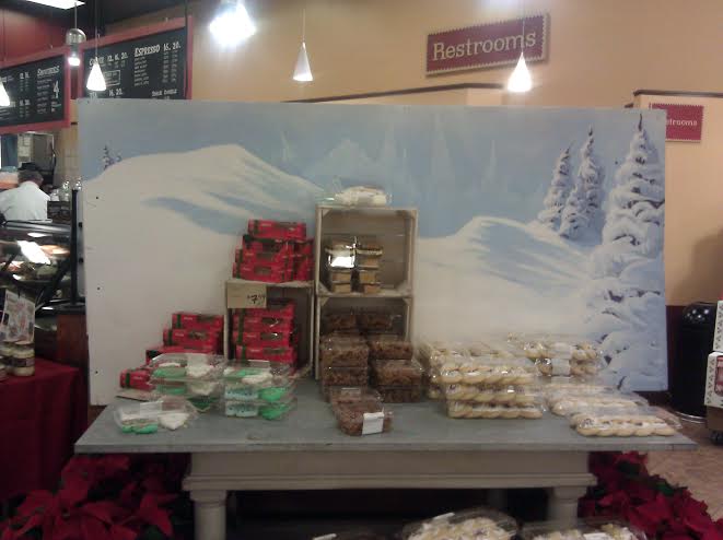
I made a winter landscape. It may have been...somewhat inspired by having seen Frozen the previous weekend.
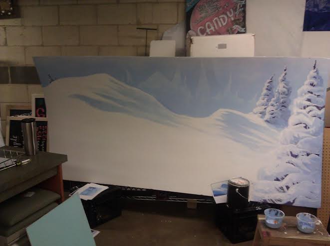
It was to cover up the unsightly back of the coffee bar.
Then there was...let's see, we have a brand of cocoa called 'Silly Cow', which is going to have a big display in January, and my boss wanted some kind of big, attention-getting something, that was silly and cute and so I made a couple sketches:
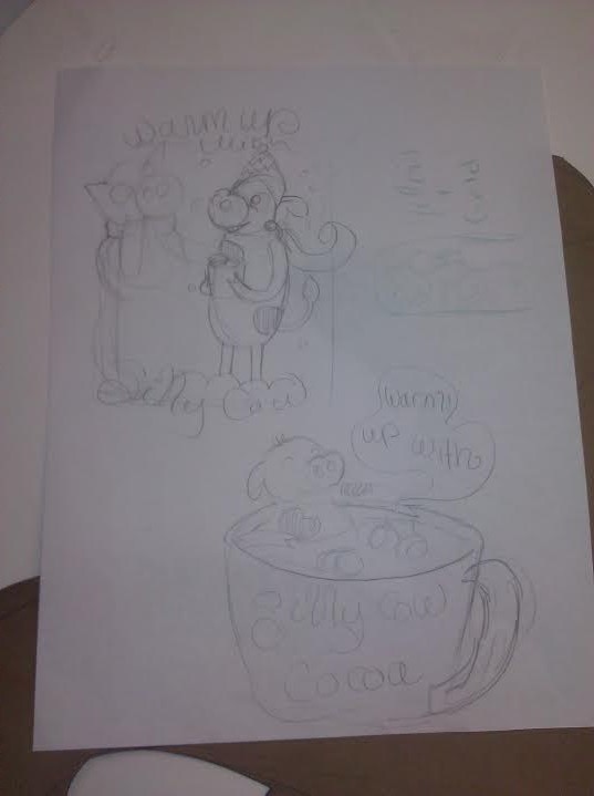
(If you can't tell, the top one is a cow sharing it's scarf with a snowcow while drinking cocoa, and the bottom one is a cow lounging in a cup of cocoa)
My boss liked the bottom one particularly.
And we already had a cup that I could use, which would cut down my work time on the project and just needed a little modification:
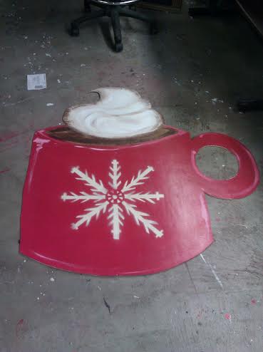
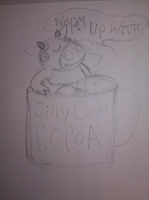
I made a new sketch, figuring out a little more exactly what style I wanted my cow to be and working in the shape of the available cup:
Then, as the project was going to be double-sided,I was very responsible and sensible and made craft paper cut-outs so I would have a relatively consistent shape for my cow for both sides:
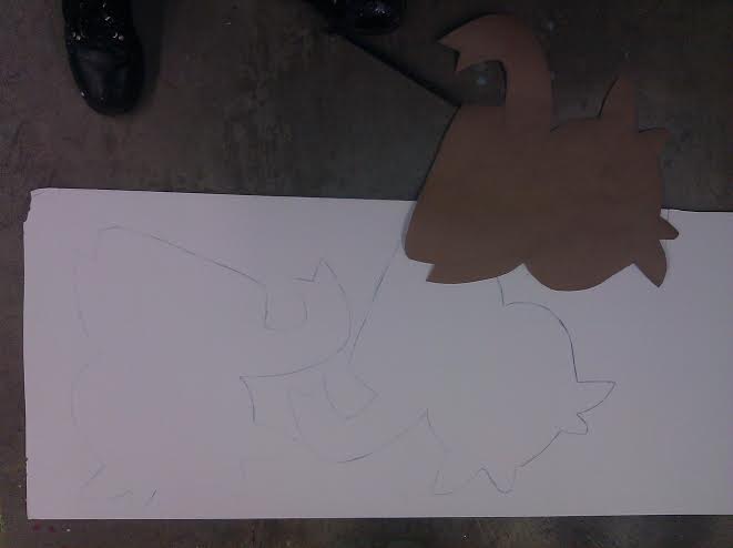
^so sensible!
Then...well, there was a lot of painting my cows and painting over existing designs on the mug, cutting off the foam fluff, attempting to try to match paint colors, some industrial stapling...but finally:
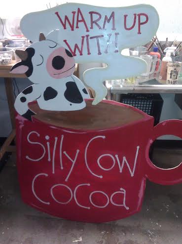
aaannnddd the other side:
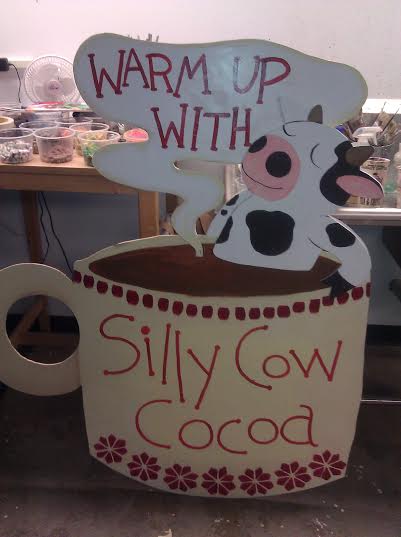
I eventually added a few marshmallows too. And look how cute.
So, this project really came together and worked. But sometimes they don't really, like one I did for chili starter. I had an idea, and the painting came out quite cozy and comfort-foody:
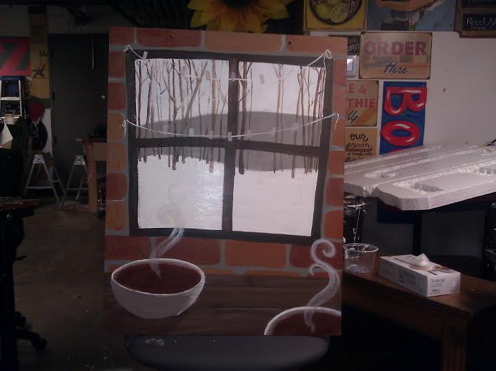
So the idea was to have the item's name hanging on the strings across the window, hipster-pennant style. I tried painting a couple strokes, but it just...didn't quite look right. So I thought, what if I just made the letters out of paper and actually 'hung' them on there?
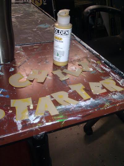
But the final product was...well:
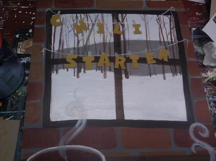
No, it's not the worst thing ever, but it's somewhat hard to read (especially from a distance), and the contrast of the real letters against the painted background is a style contrast that doesn't really mesh like it could. I messed with it for a while but it just never looked right. I did have some other ideas, one of which I think would really work, but the sign needed to be put out and there just wasn't time for me to go back in and change things. I've been itching to do so, of course, but I think I just have to let this one go and learn from my missteps.
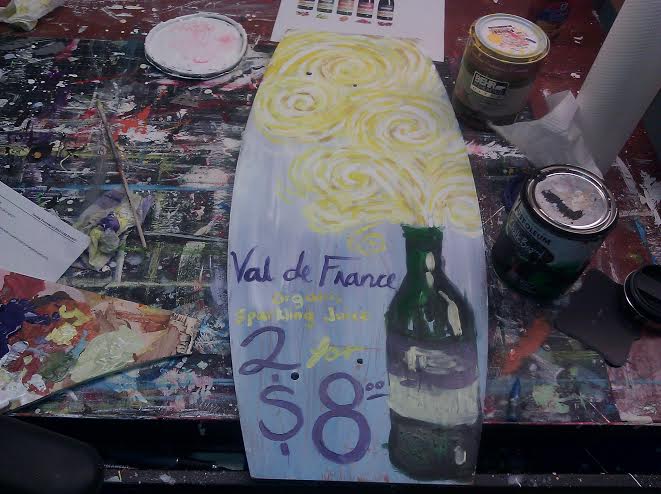
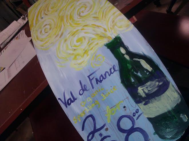
I made a little sign for Val De France. My inspiration was the style of a somewhat well-known painter from the 1800s:
Finally, this week, I was told we were doing a Pop Art theme in our lobby for January. And I needed to do a sign for water. The solution seemed pretty obvious:
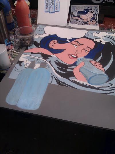
^WIP
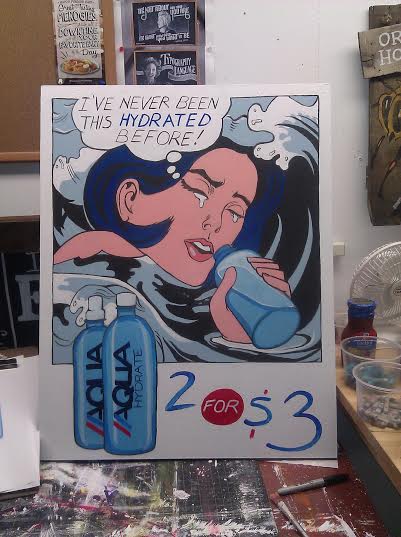
I don't know whether it is an utter sell-out of the style to use pop art (a style that famously uses images from advertising) FOR advertising...or if it is weirdly in tune with the movement.
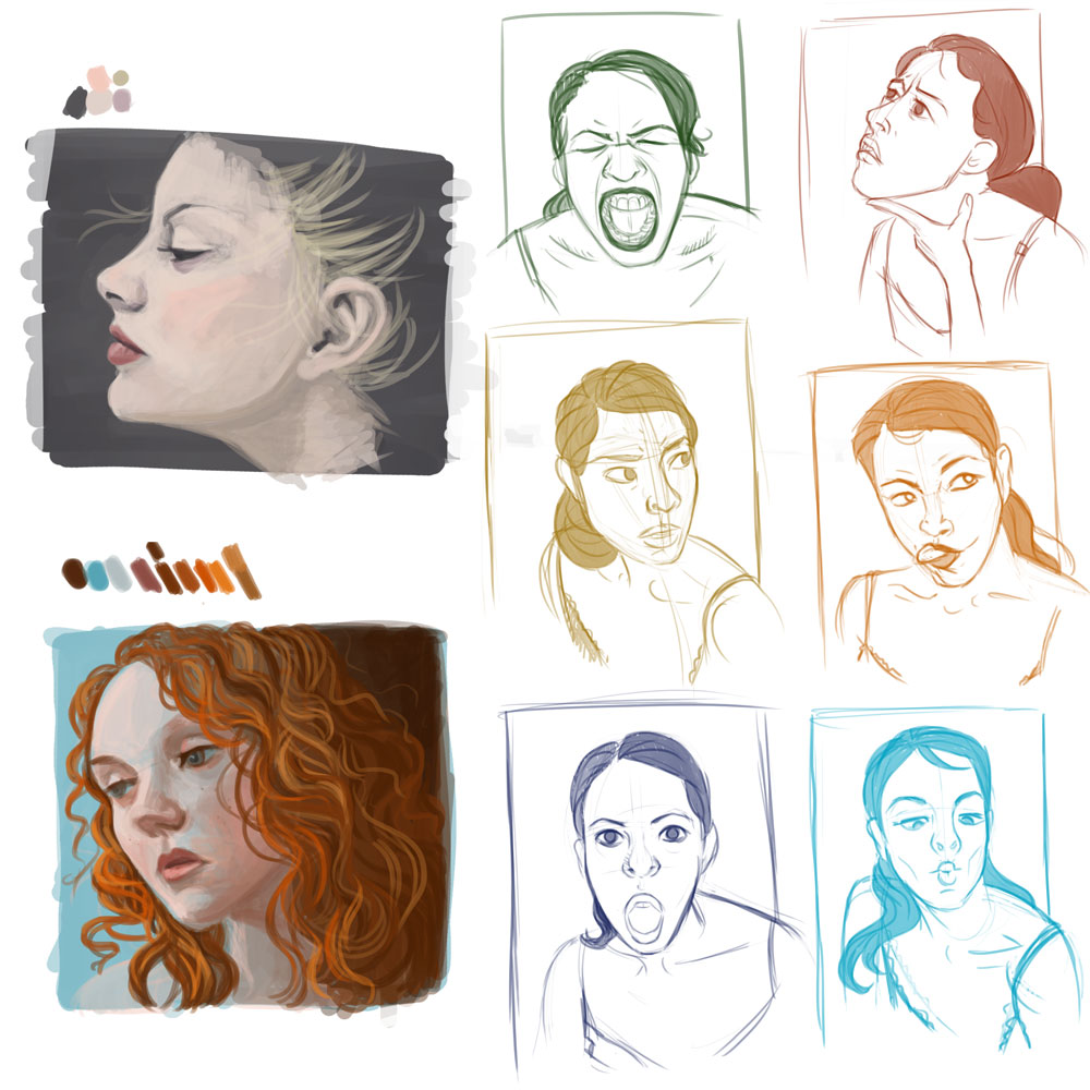
Anyway, not a lot of shiny new personal work. Did a few face and expression studies:
And now, as I have been on hold for...48 minutes....I may have to throw in the towel. If they haven't answered by the time I make tea I may simply give up.
Hope you have a gorgeous new year.