First and foremost, fantastic freelance.
My marvelous and amazing friend Crissi Langwell is an author, with a few books under her belt already, and for her latest, she decided that what she really wanted was for me to do the cover art. She hooked me up with the manuscript so I could get the feel for the story and i was immersed in a lovely tale of a young woman living in the fog-shrouded town of Bodega Bay, and her adventures with baking, and love, and magic and...well, I don't want to spoil anything for you, but the story is as sweet as the title would lead you to expect, spiced with mystery and garnished with passion. I loved it and *I* got to do the cover illustration for it!
So, after chatting with Crissi about what she had in mind, I went out to Bodega Bay to take some location shots for reference. Even though I've been there 100 times or more, and I could find photos online, this way I could find the view I was imagining and get the feel down, and it's only a short drive away so it seemed silly not to. Plus, an excuse to go out to the ocean, am I right?
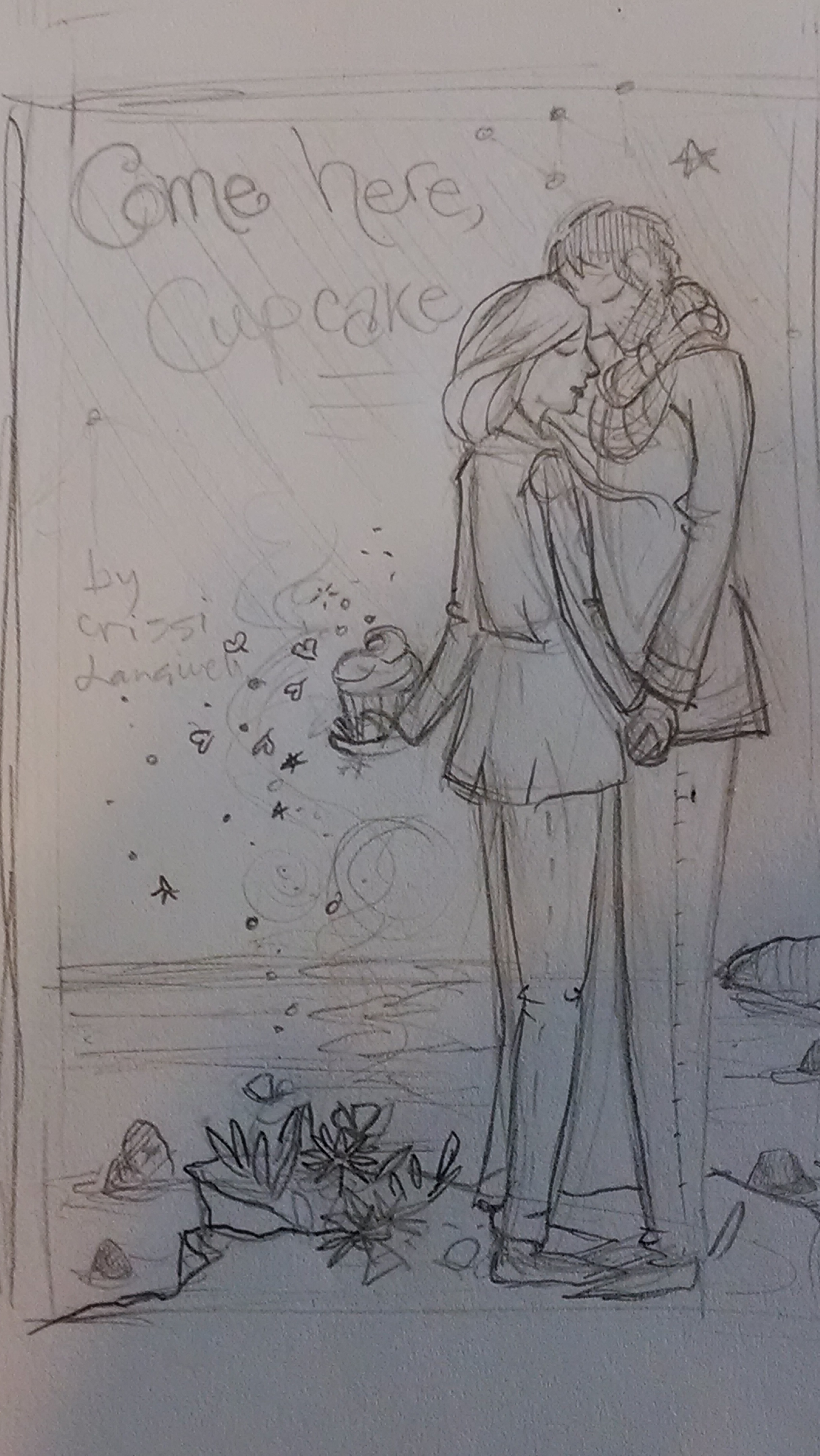
The next day I sat down to make some thumbnail sketches, both along the lines of what Crissi and I had discussed and a few other ideas in keeping with the theme of the book. I was going to post photos of them, but honestly, the photos I have were taken in bad lighting and the sketches were pretty light, so the quality just isn't good. But this one was the one she liked best. She saw it and she practically squealed. She said it was exactly what she'd been imagining. On the one hand, it IS nice when I can create something that my commissioner hadn't even really thought of that they love, but when they can tell me their idea and I can bring it to life for them, it just fills me with joy.
Anyway, I will now tax this coffee shop's wifi by trying to upload the sketch that she approved.

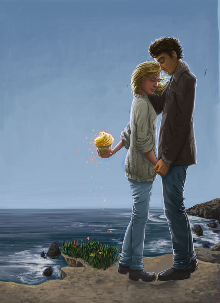
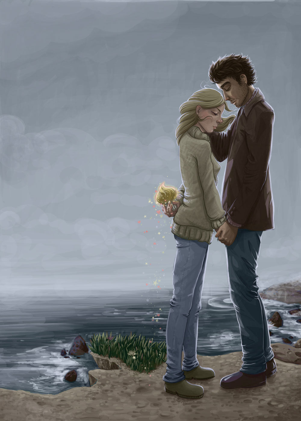
I often run into problems going from sketch to final product -- when I am doing my sketches, I work looser and go more for the feel than having everything super technically perfect. Then I usually use the sketch as my starting place for my drawing, and at that point I sometimes run into problems and discover anatomical issues and perspective problems. This experience was no difference. I ended up, before I was done, redrawing both characters entirely because oh, his legs and posture were weird and then her pose was coming out too stiff and I could NOT get her face right and I fought with it for AGES (and of course, every time I really planned to lock myself away for a weekend and work on the illustration, California would hit me with another heat wave, making my un-airconditioned apartment unsuitable for getting anything done) and so I finally went back to the drawing board with her too and fixed a few pose problems that came up along the way. And then I ended up visiting Bodega Bay midway through the process and realized that, because I had taken my reference photos on a rare sunny day, the illustration was reflecting that, which didn't fit either the feel of the book OR the feel of the town and that I really needed to make it foggy.
So here's the cringe-worthy version I couldn't get to work:

And after some blood, sweat, and tears (I won't lie, mostly sweat. Stupid summer.), here is the final version:

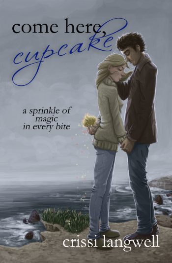
She was so stoked with how it turned out, she spent most of the night I sent it to her immediately formatting it into her cover. And this is the final result:

This is so exciting! That book is going to be on like, bookstore shelves! And I drew that picture that's on it! *squeals and runs around in circles* And the author loves it! *swoons*
Anyway, I think my apartment may have cooled down enough that I can stop living in this coffee shop, so that's a wrap for tonight. Tune in next week for exciting pictures of what I do all day at work...when I'm very very lucky.