
Waiting for Lightening to Strike
A very hyperbolic and overblown title to describe the fact that I’m procrastinating package design for a few minutes while I let my brain try to find inspiration for random sports equipment.
What’s new world?
Well, you’ll just have to let me know in the comments down below.
What’s new with me? This and that.
I was notified by my soon to be apartment managers that I can actually move in early if I want, so I am going to get all official a week before my planned move in, so that by the weekend of the 23rd I might actually have power and internet…plus I have plans to measure, and to paint at least one wall — I’m gonna have an accent wall! It’ll be groovy!
I’ve been itching to art. Unfortunately, during the week, that means an hour at lunch time — and even less on days like yesterday when I was fruitlessly trying to contact the Humane Society to learn what I need to do to get my stray half cat neutered and vaccinated so he can move with me. After yesterday’s thirty minutes on hold, however, today I willendeavor to finish up the little pinup I am playing with and just go into town on Friday to find out what I need to, as I am apparently getting dragged to some art opening at The Mattress Factory. I dig art openings but am intimidated by the hipsters I expect will be in attendance, giving me snooty looks because my shoes are mainstream, or I haven't heard of their favorite band or because I enjoy something.
Social situations stress me out.
But, hey -- art opening! I might find some more inspiration. That's kind of a joke, because I have inspiration coming out of my ears right now. Like this picture: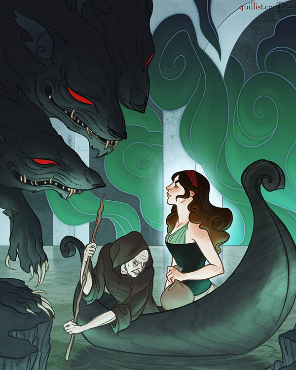 (Totally not my art you guys. Just to make that clear. It belongs to Dana Guerrieri who is super talented.)
I've been really fond of stylization lately and wanting to move into doing some work that's a little less realism...but I'm totally not there yet. Certainly not HERE yet. Look at the perfect details, the super clean line art, the use of value and symbolic shapes rather than a super realistic landscape! Oh, and those greens and reds...stunning. The pinup I'm working on right now actually uses greens and reds too, but not nearly this well. She really nailed the technique of using lots of under saturated color to make the super-bright complement really pop. Stunning.
Then there's this:
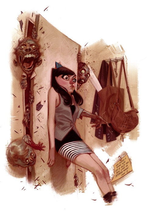
Such great expressiveness! So sketchy and loose, yet still totally a complete piece -- the unfinished edges...I can never leave an edge unfinished, and I love that look! (This belongs to Julian Totino Tedesco)
And this:
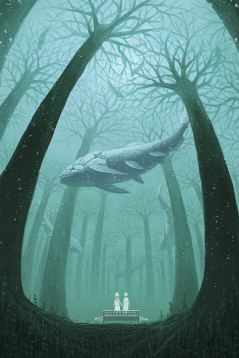
The depth and atmosphere...that fading into the distance and the use of value...stunning. (This belongs to this person. I think.)
And this!
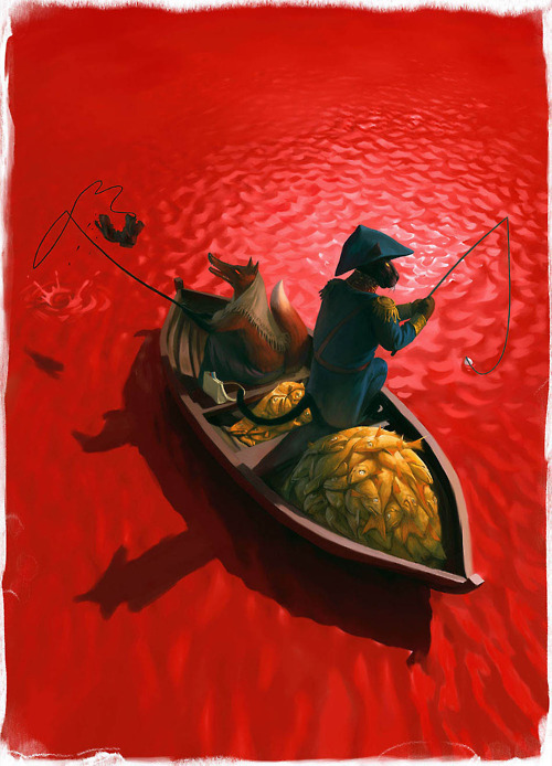
The perspective! THE COLOR! And those water ripples...why can't I make fabulous water ripples like that and also have the confidence to make my main color a glaring RED? Wow. (This belongs to Waldemar von Kozak)
I really hope for some solid sit down and art time soon. I have many areas that need my attention. Clearly.
And now, sports equipment packaging awaits.
 Rachel Corn-Hicks
Reader Comments